For a long time, we’ve offered our built-in templates in a variety of color schemes. But for a long time, we’ve felt that we could make those color schemes even better—which is why we’re excited to tell you about another new feature in Direct Mail 3.5: 100% customizable color schemes.
Selecting a Color Scheme
Most of our templates come in a variety of color schemes. You can identify templates with alternative color schemes by looking for the four-color icon in our template chooser.
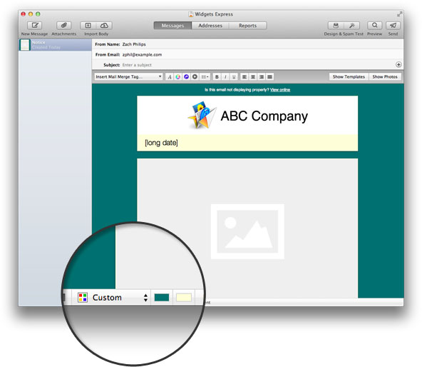
Once you’ve chosen a template, you can select a color scheme from the popup menu at the bottom of the window.
Customizing a Color Scheme
Want to tweak the background to better match your logo? Want to use a different highlight color to really make your message pop? No problem. In templates that support customization, you’ll see one or more color wells show up next to the color scheme popup menu.
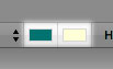
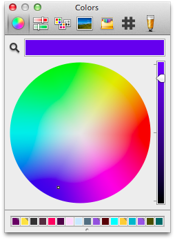
Each color well controls a different color (e.g. background color, link color, accent color, etc.) To change the color, simply click on the color well and pick from the palette that appears.
Templates With Brains
We wanted to make it easy to brand a newsletter with your colors while not getting bogged down tweaking every accent or text color to match. Our solution was to give our templates some smarts in picking complementary colors. You’ll notice that text, shadow, and accent colors will automatically be set to tints and shades that best complement the background and highlights colors you select. Direct Mail makes you look like a design pro!
Upgrading Direct Mail 3.4 and Older
If you’re upgrading to Direct Mail 3.5 from an older version, you’ll need to create a new message from the template chooser in order to enjoy these new features (and refreshed designs). Don’t worry, your existing messages will continue to display, edit, and send as before.
We think our new customizable color schemes will help you create even better looking newsletters. Try picking colors that complement your logo or brand—and, of course, try and avoid colors that might be a distraction. As always, we’d love to hear what you like (or don’t like) about these great new features. Feel free to sound off in the comments or send us an email.
P.S. For those power users out there, we’ve added a convenient hex color picker to the color panel. Look for it under the “#” icon.
