Great-looking email designs help your business project a professional, polished image and can win you the confidence of your subscribers. With its intuitive editor and great selection of templates, Direct Mail can help you get up and running with a great looking email in no time. In this blog post, we want to share a few tips to help you get your designs looking just the way you want.
Adding, Moving, and Deleting Sections
Many of our templates come with sections that you can duplicate, move, or remove. Use this flexibility to lengthen or shorten the newsletter to fit your content—instead of forcing your content to fit the newsletter. You can identify these flexible sections by hovering your mouse over various sections of the template and looking for the following toolbar to appear:
![]()
Here’s what each of those icons mean, from left-to-right:
- Delete. Deletes the section
- Duplicate. Makes a copy of the section
- Move Up. Moves the section up one slot
- Move Down. Moves the section down one slot
In the following example, I’ve taken the “Sidebar (Right)” template and duplicated the Headline One section to make a Headline Two section:
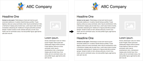
Use these flexible sections to adjust the template to fit your content. You might also be interested in these helpful tips to keep your email content fresh.
Working With Images
Text Descriptions
Nowadays, nearly all email clients default to not loading images contained in the message body. The recipient can choose to load them if they want, but most do not. That being the case, it’s important to make sure your email looks good (and is understandable) even when the images aren’t loaded. One great way to do that is to make sure that you provide text descriptions for any image you add. For example, here’s a newsletter with an image of a car at the race track:
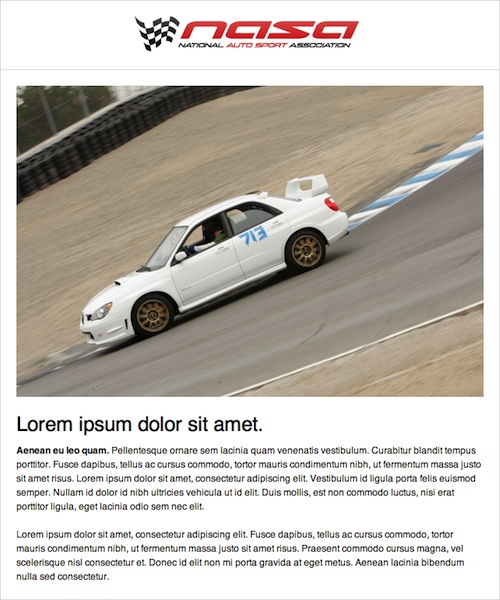
To add a text description, just click it and fill out the field labeled “Description”:
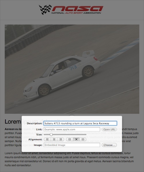
That’s it! Now when your message is sent, the recipients will see a helpful text description instead of a big, blank box:
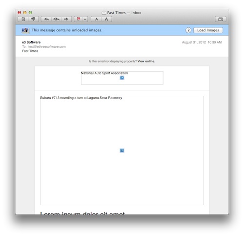
As a bonus, text descriptions are a huge help to sight-impaired readers, as most computers and smartphones can read those descriptions aloud.
Composite Images
As you already know, it’s easy to add images to your email. Just drag and drop them into the message body (or copy and paste). Some templates, however, provide special placeholders called composite images. Composite images automatically apply great looking effects like drop shadows, borders, and overlays to any photo or image you drop on them. You can identify composite images by hovering your mouse over them and watching as the image darkens, like this image from the Air Mail template:
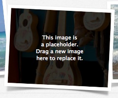
To add your own image, just drop a photo into the placeholder position, like this photo of a company outing:

Looks good, but we can’t see anyone’s face! Click the image to pop up an editing panel. Drag the Size slider to the right to zoom in the photo. Drag the image itself to get the faces centered just right (the cursor will turn to a hand icon to let you know you can pan the image). Much better:
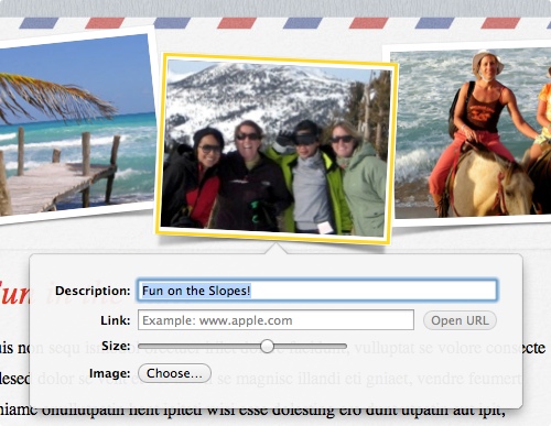
Composite images are an easy way to add a professional touch to your messages. Use the zoom and pan controls to get your photos looking just right!
Conclusion
A great-looking email design will help boost your open and click numbers, as well as project a professional image to your readers. Try using Direct Mail’s streamlined templates, flexible sections, and image tools to get your emails looking just the way you want, and stay tuned to our blog for more great tips. Thanks for reading!