Direct Mail’s built-in templates are engineered to look great across a variety of devices and screen sizes. Even better, Direct Mail’s built-in editor ensures that any customizations, changes, or redesigns you make continue to look their best on all devices—with no extra work required on your part. If you’re a power user, though, you might find yourself wanting to customize your subscriber’s email experience even further based on what device they use to read your email. If that’s you, check out today’s pro-tip:

Did you know that you can show different content to your subscribers based on the kind of device they are reading your email on? This can be useful for customizing the layout or design of your newsletter for large or small screens. For example, the “Dive In” template that comes with Direct Mail uses this feature to show a slightly different header when the email is viewed on a mobile device.
Here’s how to do it (you must be using one of our modern templates):
- Click on the section that you want to customize
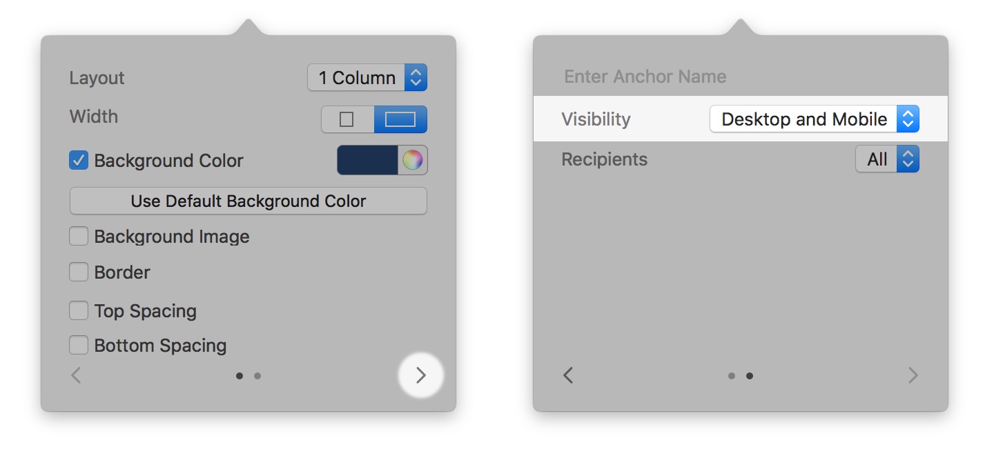
- Click on the right arrow at the bottom of the pop-up window
- Click on the “Visibility” pop-up menu and choose Desktop and Mobile, Desktop Only, or Mobile Only
You can use the Preview window‘s “Simulate Screen Size” feature to check out the results!