If you’ve ever attempted to code up HTML email by hand, you know that it can be a painful task. This blog post provides a better understanding of some of the limitations of HTML email, as well as tips on how you can avoid potential problems . I’ll also point out how Direct Mail’s built-in editor can help makes things easier.
How Email Clients Mangle your Message
When an email client receives your email, the first step it takes is to “clean up” the message to remove (1) potentially harmful content, (2) content that could be used to track the recipient, and, (3) in the case of web-based email clients, content that would cause the email to interfere with other objects on the web page. I’ll address each one of these in detail below.
Harmful Content
Javascript and other HTML elements that are not used to render the email are stripped to prevent untrusted and/or unknown code from being executed when the email is opened. This includes, but is not limited to: <script>, <iframe>, <object>, <embed>, <applet>, and <param> elements. Some email clients will even strip out unrecognized elements just to be safe. If you use Direct Mail to import your message from a web page, it will remove these elements for you by default. If your webpage requires Javascript in order to render or function properly, it will not work (or at least will require some editing in order to work) as the message body of an email.
Normally, email cannot contain embedded video (since it would require the use of the aforementioned untrusted elements). However, Direct Mail provides an easy solution to embed video thumbnails with links right into your message.
Trackable Content
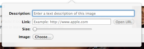
Your HTML email may depend on assets that live outside of your HTML email on a web server. They could be hosted images or stylesheets. Email clients generally break these links and, in the case of images, prompt the user to choose whether they want to display them. This is to prevent your email client from loading web content without your permission, especially since loading web content from an external source is how most email tracking systems gather their data. To make sure your email still looks good even without images loaded, we recommend filling in the ALT attribute for every image. You can do this in Direct Mail by clicking on an image and filling out the “Description” field.
Interfering Content
Web-based email clients have to account for cases where your CSS selectors conflict with the ones they use to style their site. Some email clients will rip out your styles altogether to avoid problems, but newer web-based email clients work around this problem by prefixing their own selectors with a unique string, thus avoiding a conflict. The best way to avoid problems with styles is to is to inline your CSS. Direct Mail can inline your CSS for you when you send. That way you can keep your markup and CSS separate during the design phase.
An additional concern when designing for web-based email clients is CSS styles related to layout and positioning. Most HTML designers are used to being able to position elements in their designs with properties like: position, display, left, right, top, bottom…but for a web-based client, this could mean your content ends up positioned over the user interface of the email client. To prevent this, most email clients will strip out position-related properties from the email. From the perspective of HTML designing, this provides very severe limitations and is the reason why HTML emails are still largely composed of tables.
The folks over at Campaign Monitor have put together a comprehensive list of which CSS selectors and properties are supported by which clients.
The Final Hurdle: Layout Engines
Every email client employs a layout engine to render your HTML email into a window. Unfortunately, not all layout engines implement HTML standards the same way. Furthermore, different layout engines adopt new standards at different rates, making very difficult to write your code in a one-size-fits-all approach. One result of this is that if you’re editing your email in Direct Mail (which uses the WebKit layout engine), it may look very different when rendered in a Trident-based browser, such as Internet Explorer.
There are 5 layout engines that will be used to render close to all of your emails:
- Trident – Internet Explorer – Outlook 2003, Outlook Express
- Webkit – Safari, Chrome, Apple Mail, iOS Mail, Android Mail, Postbox, Outlook 2011 for Mac, Sparrow, Nokia
- Gecko – Firefox, Thunderbird, PostBox, SeaMonkey, Eudora
- Presto – Opera, Nintendo, Opera Mail
- Microsoft Word – Outlook 2007/2010
If your recipient is reading your email in a web-based client (Gmail, Yahoo! Mail, Hotmail, AOL Mail), then the layout engine will depend on the browser they’re using. In Version 3.2, we’ve added design testing to your tool belt, giving you the ability to preview your message in dozens of clients with just one click. The design test will show you a pixel-accurate screenshot of what your email looks like when viewed on various platforms, as well as how many of your recipients are using that particular client.
The Rise of Mobile
The volume of email being opened on mobile devices has increased dramatically over the past few years. This trend will only continue as more people adopt smartphones and tablet devices.
Your email may look amazing on a desktop, but on a phone it might have too much text crammed together to be easily digested. Make sure that your calls to action are not too small for the reader to engage with.
One great thing about mobile email is that the popular mobile email clients (iPhone, iPad, Android) are much more up-to-date on the latest HTML and CSS standards, and don’t mangle your HTML and CSS nearly as much as their desktop- or web-based counterparts. Note, however, that the above mentioned mangling still applies to web-based email clients viewed on a mobile device (i.e. viewing Gmail on your iPhone). One thing to be aware of is that many mobile devices include a feature that automatically boosts the size of text for readability. If your design does not account for this, you might end up with a broken layout.
All of the templates that come with Direct Mail are mobile-ready and will look great on any device. In addition, we are working on a special set of templates designed exclusively for mobile devices. Look for announcements on that soon!
Conclusion
We hope this post has helped shed some light on what to be aware of when designing your HTML templates. Features in Direct Mail like video thumbnails, CSS inlining, and mobile-ready templates can help you overcome some of these difficulties, and we can’t wait to show you what we’re working on next to make this process even easier. Stay tuned!
