Everyone knows that the bigger their email list, the better, but when it comes to email marketing, the quality of that list is just as important. What do we mean by quality? Engagement. The best mailing lists are filled with subscribers that open and act on the emails that they receive. Our friends at Return Path recently compiled a list of tips for building a larger, more engaged email list. You can check out the entire guide here, but we’ve highlighted some of our favorite tips below.
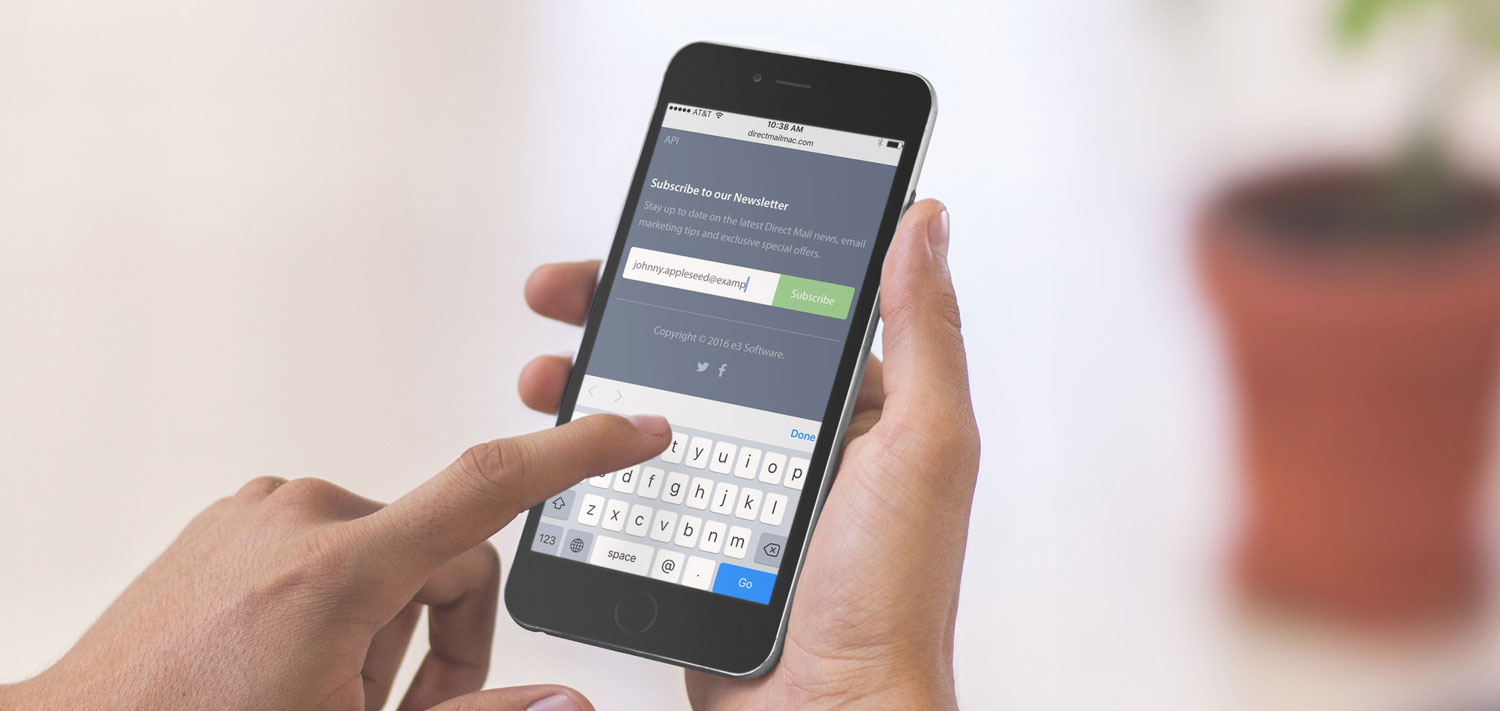
Before we begin, don’t forget that Direct Mail makes managing your email list sign-up process easy! You can create a subscribe form in Direct Mail, connect it to your website or Facebook page, and even integrate it into the other services and apps your company already uses.
Experience Your Customer’s Point of View
Take a step back and view your mailing list sign-up process through the eyes of your customers. For example:
- Is your email list sign-up form easy to find locate on your website?
- What about on a mobile device?
- Have you clearly spelled out the benefits to signing up for your list?
- Have you set the right expectations for how frequently you will email them?
- Have you removed as much friction from the process as possible? For example, if you have a lot of required fields on your subscribe form, consider making some of them optional.
Get Your Relationship Started on the Right Foot
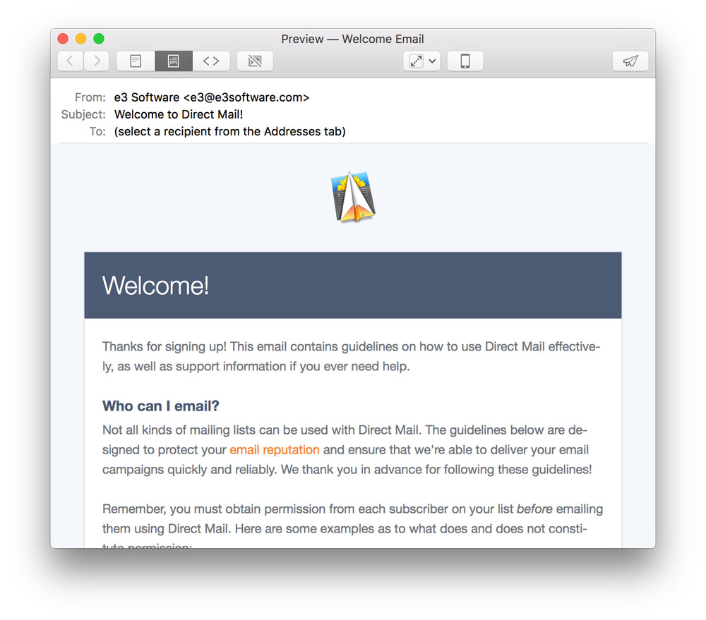
What do your subscribers see after they’ve signed up for your list? Creating a custom “thanks for subscribing” page or a welcome email can help get the relationship started off on the right foot. See this help article for how to configure Direct Mail to send a welcome email to your new subscribers. Or click here to learn how to set up a custom web page that new subscribers will see after they sign up.
Also, it’s great to entice new subscribers with promises of special discounts, exclusive content, early access, etc.—just be sure you follow through. Be sure that your email newsletter delivers on any promises you may have made during the sign-up process.
Promote Your List
Don’t be satisfied to let your sign-up form hide away in the footer of your website. There are lots of places you can promote your mailing list:
- Make signing up for your list part of your online store. You can use our Zapier integration to connect Direct Mail to Shopify, Magento, Gumroad, and other online stores. Check our API for building custom integrations.
- Do you send out email receipts or other transactional email? Consider including a link to your email list sign-up form in those emails, too!
- Include an email sign-up form on your Facebook page. Direct Mail makes it easy.
- If you have a physical retail location, use our iOS app to turn any iPad into a email list sign-up kiosk.
Leverage Social Media
You can give your email list a boost by promoting it from other social media channels that you may already operate. For example:
- On occasion, promote the benefits of your email list to your followers on Facebook or Twitter and include a link to sign up
- Purchase a “promoted tweet” that advertises the benefits of your email list and includes a sign-up call-to-action button
- Annotate your YouTube videos so that viewers can click-through to your website or email list sign-up form
- Purchase a sponsored post on Instagram that entices your followers to sign up
Here We Grow!
If you found some of the above tips useful, we encourage you to check out Return Path’s full guide of 50+ tips at this link. These suggestions can help you grow the size of your email list and improve subscriber engagement, building the foundation for a powerful email marketing channel. If you have any questions or comments, please get in touch and tell us what you think. We love to hear from you!

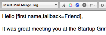
![The "[first name]" mail-merge tag being used in a greeting](https://directmailmac.com/blog/wp-content/uploads/2013/01/mmt-simple.png)
")


